• Willkommen im Geoclub - dem größten deutschsprachigen Geocaching-Forum. Registriere dich kostenlos, um alle Inhalte zu sehen und neue Beiträge zu erstellen.

Change color & font in headline

m1m3r

Geocacher
Sorry for not writing this in German, I can read it pretty OK but not write it... :roll:

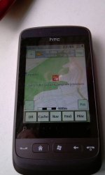
Is it possible to change at least the color of the headline (that says "Kungs Norrby" in the picture)? Solid black would probably suffice.

http://piclair.com/0yfn1

It's almost impossible to read it from a small distance when I have the phone in my car holder.

I'm using version .494.

Thanks for a great piece of software!
 

Joe_M

Geocacher
Übersetzer schrieb:
Tut mir leid, dass ich nicht auf Deutsch schreibe. Verstehen kann ich es, aber nicht selbst schreiben :roll:

Wäre es mögliche die Farbe der Titelleiste ("Kungs Norrby" auf dem verlinkten Bild) zu ändern? Ganz schwarz würde vermutlich reichen.

http://piclair.com/0yfn1

Es ist fast unmöglich es aus kurzer Entfernung zu lesen, wenn das Telefon im Auto in seiner Halterung steckt.

Ich benutze version .494.

Danke für dieses tolle Stück Software

It used to be black. Believe me, this is an improvement. When there was only a little sunshine, it was even harder to read than now.

Regards,
Joe

Übersetzer schrieb:
Sie war mal schwarz. Glaub mir, so ist es besser. Bei nur ein bisschen Sonnenschein sah man weniger als jetzt.
 
OP
M

m1m3r

Geocacher
Sounds strange since I can read the time (19:25) perfectly in every condition?
 

hanknstone

Geocacher
moin moin ...

my 5 cent: ich halte diesen "outlined Font" nicht für eine Verbesserung.
Auf dem HD2 mag es ja noch lesbar sein, aber auf dem HTC Touch2 (mit dem ich derzeit unterwegs bin) ist das, gerade bei Sonneneinstrahlung, kaum noch zu lesen - und wenn die Cachenamen länger sind, und durchscrollen, ist es mit der Lesbarkeit ganz vorbei....

gruss - uwe
 

Anhänge

  • IMAG0002.jpg
    IMAG0002.jpg
    45,7 KB · Aufrufe: 328

wifowaechter

Geocacher
Die Cachenamen waren in den 300er-Versionen auch durchaus schwarz, dies wurde dann von hannes! wegen ganz ähnlicher Anregungen (weiß ich nicht megr genau) in die heutige Version abgeändert.
Ich persönlich fand die schwarze Variante aber auch günstiger.
 
OP
M

m1m3r

Geocacher
I *think* the two posts above support my cause, one simple solution would be to just have an option for this in the settings.

Open the link and take a few steps away from the screen, the cache title becomes unreadable almost instantly but the time can be read from across the room.

http://piclair.com/0yfn1
 

Joe_M

Geocacher
m1m3r schrieb:
I *think* the two posts above support my cause,
You're right ;)
m1m3r schrieb:
one simple solution would be to just have an option for this in the settings.
The thing is, that cachebox is supposed to stay as simple as possible. If a setting for every small thing is implemented, working with the program will get very confusing especially for new users. The documentation is still being written and even if it was done, simpler is better ;)

I agree with you, that the current headline is not ideal. IIRC the calls for improvement back then weren't for white writing anyway, but for a lighter background color to increase the contrast. I don't know if that was changed in the meantime, too. The contrast is definitely better, but the purchase of a new smartphone might have helped here.

Consider though, that the time is displayed using a bolder font. That also helps the readability of the clock. If that font were used for the cache title even shorter names would have to be scrolled through, though.


Regards,
Joe
 
OP
M

m1m3r

Geocacher
I agree that simpler is always better, as long as it doesn't cripple the user experience. Most titles are already scrolling so using a bold typeface would not change much.

Knowing what cache you're given directions to while driving is vital and it's a shame that this rather simple thing is the biggest (maybe even the only) thing that constantly annoys me with Cachebox.
 

hannes!

Geocacher
moin,

how about changing back to black and using a bold typeface just as i did with the time? do you think that would be a solution?

best regards,
hannes!
 
OP
M

m1m3r

Geocacher
For me that would be an excellent solution!

If the option existed, I would probably change the color of some other things as well, but it's not nearly as vital as the cache name. Is making cachebox skinnable something that you're considering?
 
Oben